

We may earn revenue from the products available on this page and participate in affiliate programs.
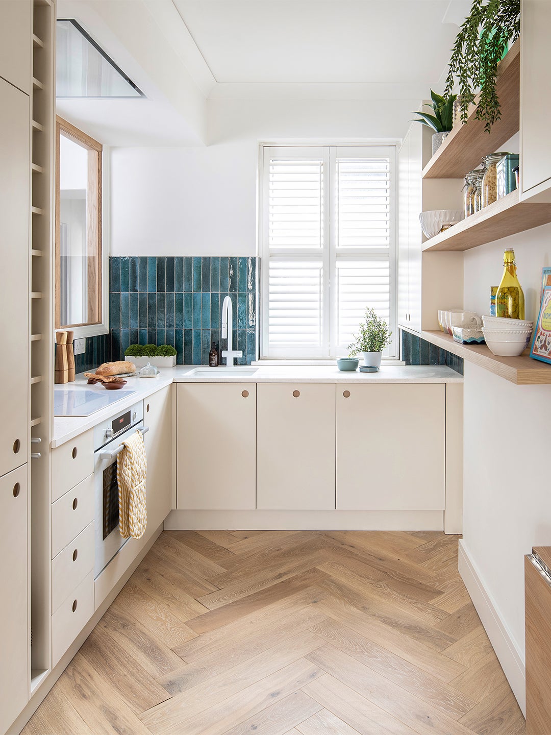
There are only so many ways to make a tight kitchen feel airy and spacious without taking down a wall or three. Luckily, British designer Alexandria Dauley knows them all. And when she was hired to overhaul the kitchen in a client’s 550-square-foot flat in London’s Battersea neighborhood, the founder of Dauley Designs put those space-saving smarts into practice. “It was slightly awkward and quite narrow,” Dauley remembers; the appliances had been crammed into any empty cranny. “But the bones were good.”
By tearing out some cabinetry and updating the color palette, Dauley opened up the room visually rather than literally. The addition of a clever disappearing table, which she designed, gives the client a dining spot for two—or extra floor space—in an instant. “We managed to squeeze a lot into a small area,” says Dauley. Read on to see how.
Make Big Changes a 2-for-1 Deal
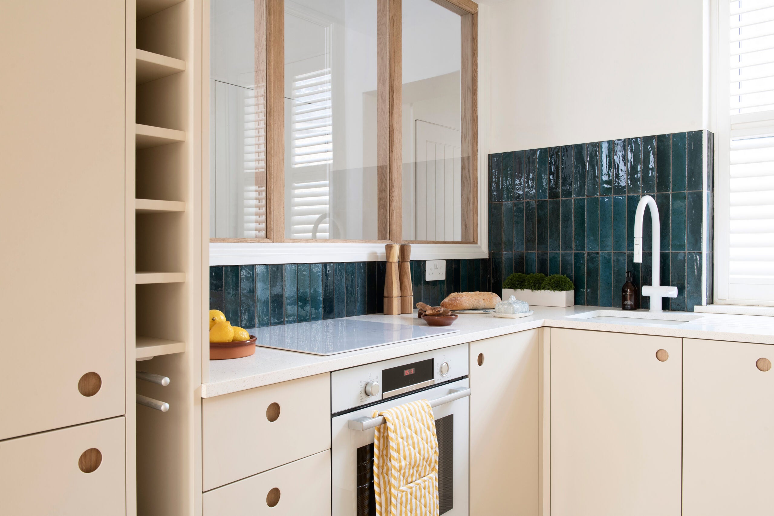
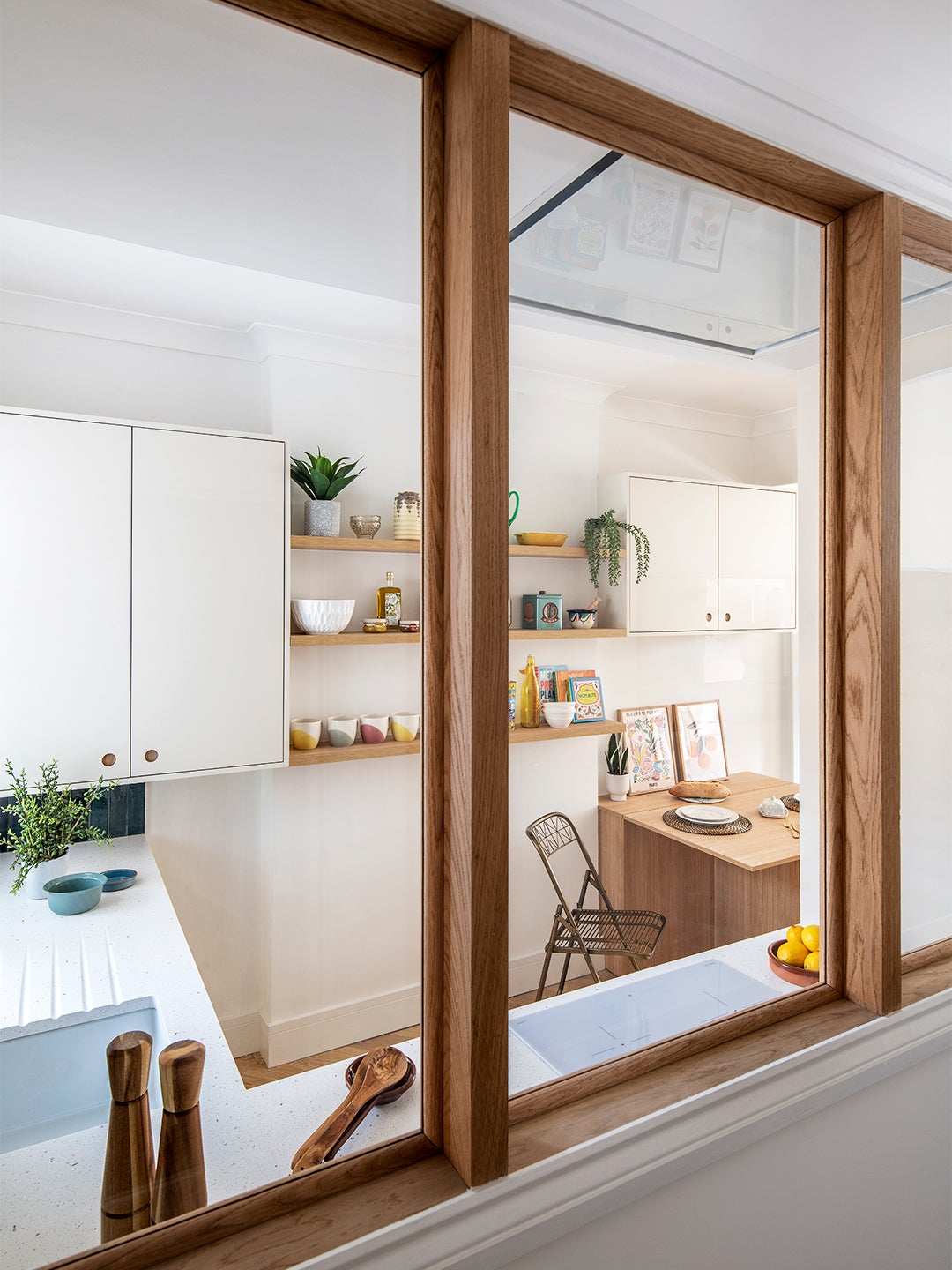
“The first thing that I decided to do—even before I knew what the kitchen was going to look like—was to put in that internal window,” explains Dauley. The wall that used to house all the kitchen’s upper cabinets plus a bulky range hood is now a portal to the flat’s entryway. “We stole a little bit of light from the kitchen and living room, which flooded into the hallway,” says the the designer. “So suddenly, what was a really tight, oppressive space felt much larger.”
Lighten Everything Up
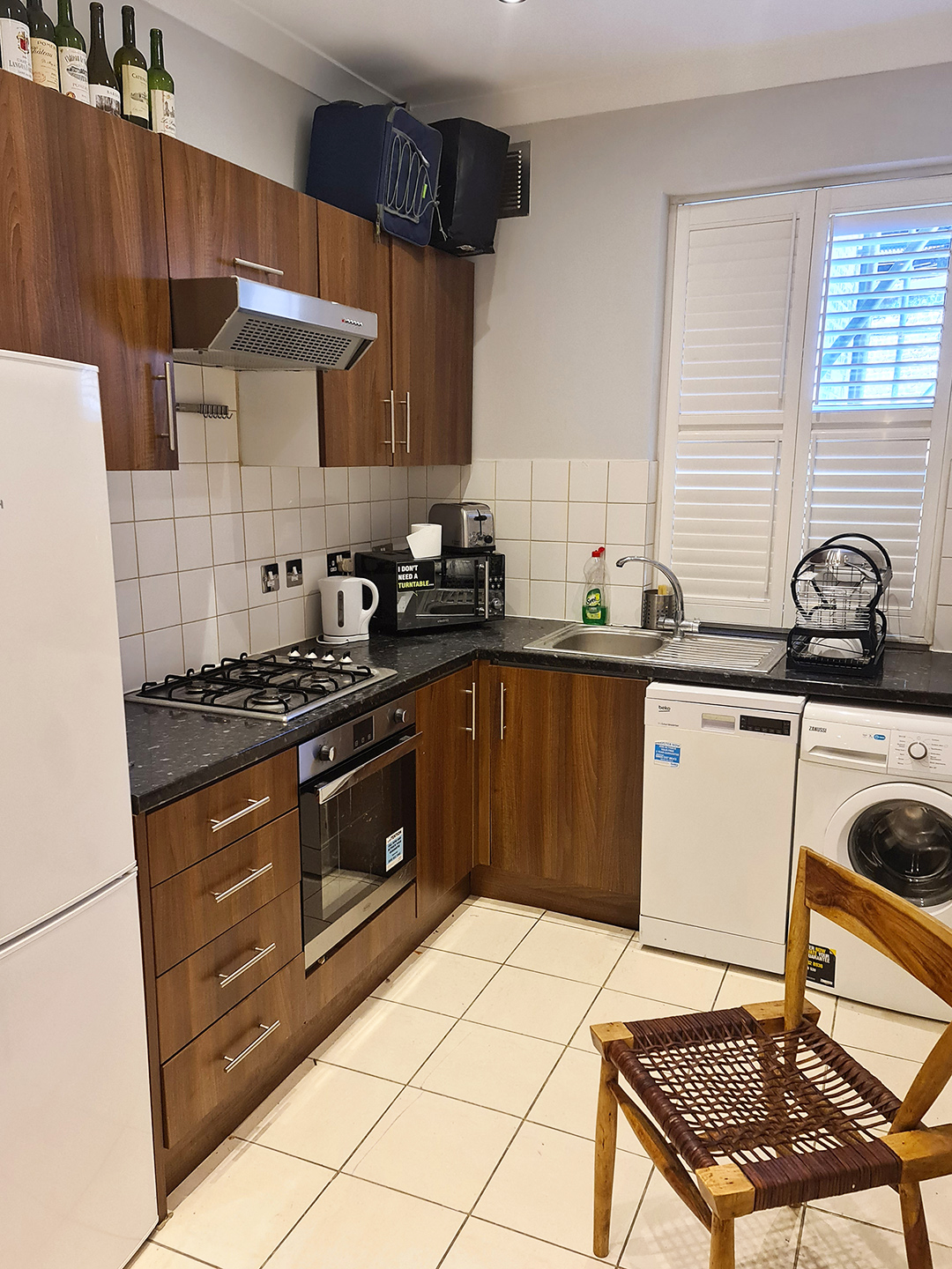
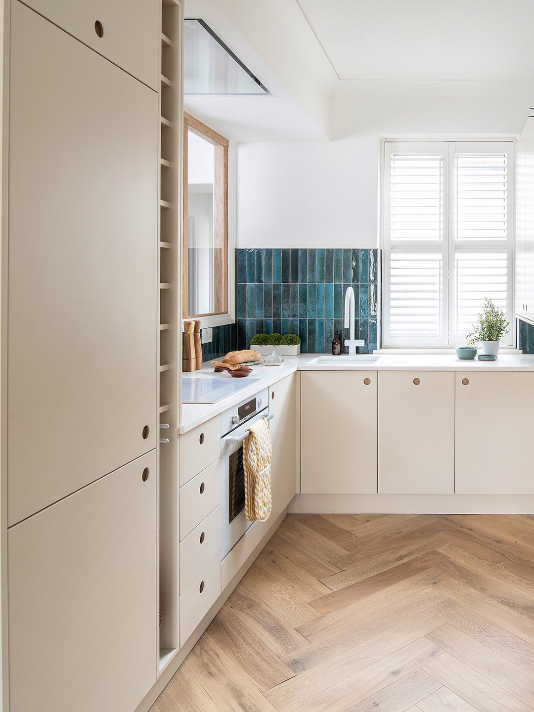
The original dark cupboards and black countertops made the small room feel even smaller. Instead Dauley opted for cream-colored fronts, white walls and appliances, and engineered oak floors. Hardworking Apollo quartz—a white composite with flecks of blue and green—lines the counters. “The accent color in all of the rooms is blue in various shades,” notes Dauley. “We have a deeper teal in the tile in the kitchen.” Its glossy finish also bounces light around the space.
Smooth the Way
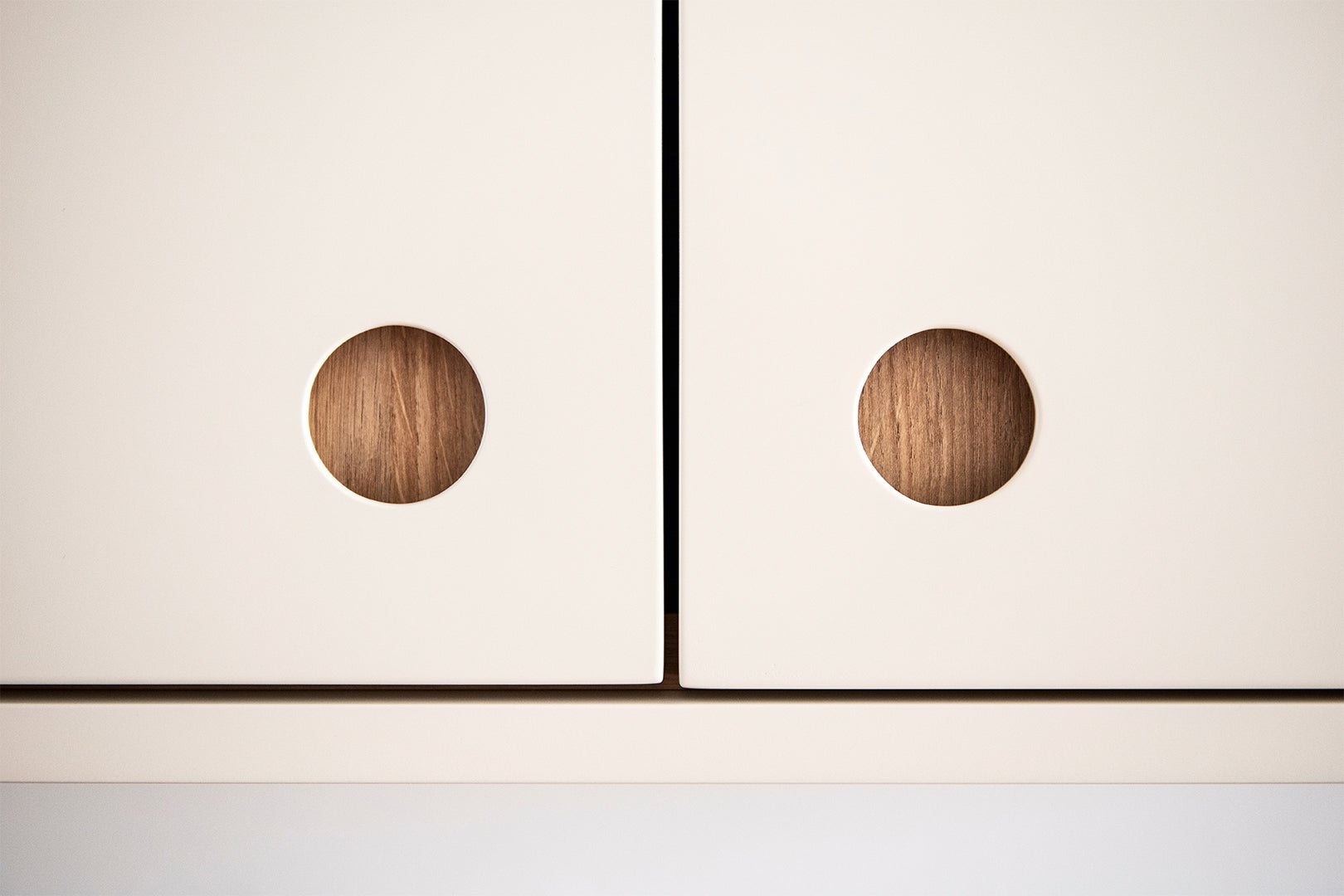
“You might not think a handle would take up space,” Dauley says, but it does—visually at least. So the cabinetry features unobtrusive circular finger pulls, and the refrigerator, dishwasher, and washing machine are all hidden behind matching custom panels. Yes, the range is in plain sight, but its white finish blends into the neutral surroundings more seamlessly than stainless steel would.
Remember the unsightly vent hood? Even with the new interior windows, some kind of extractor was still necessary, but the designer was able to inset one into the ceiling. “Actually very handy for small spaces,” she points out.
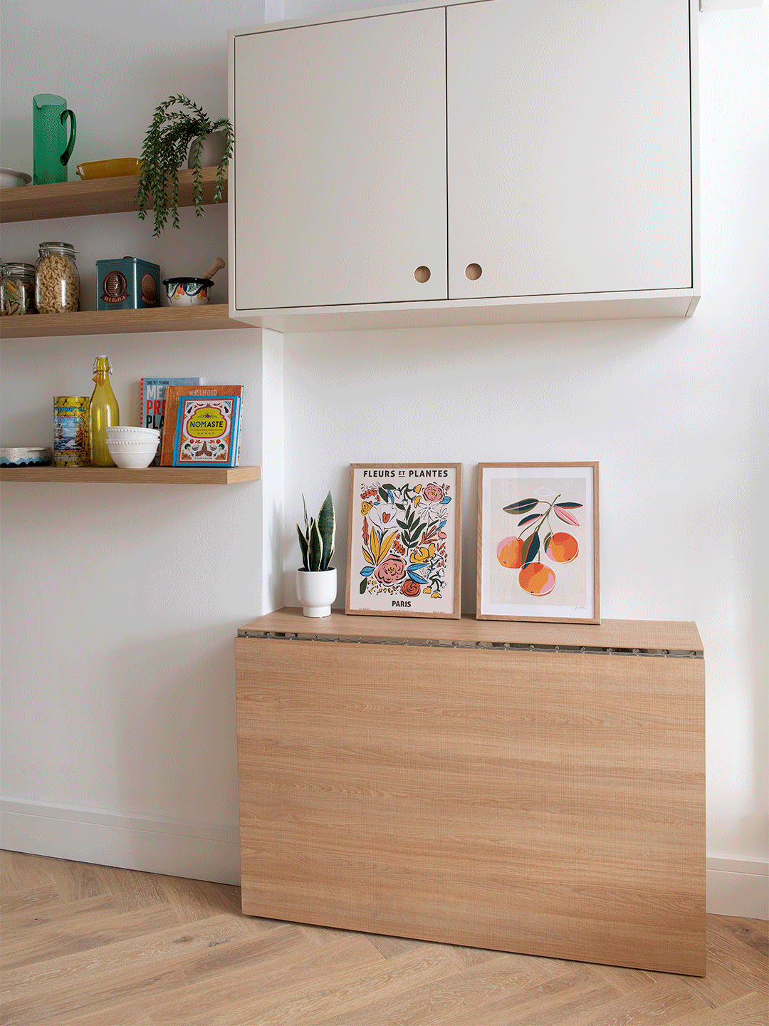
Bake in Function
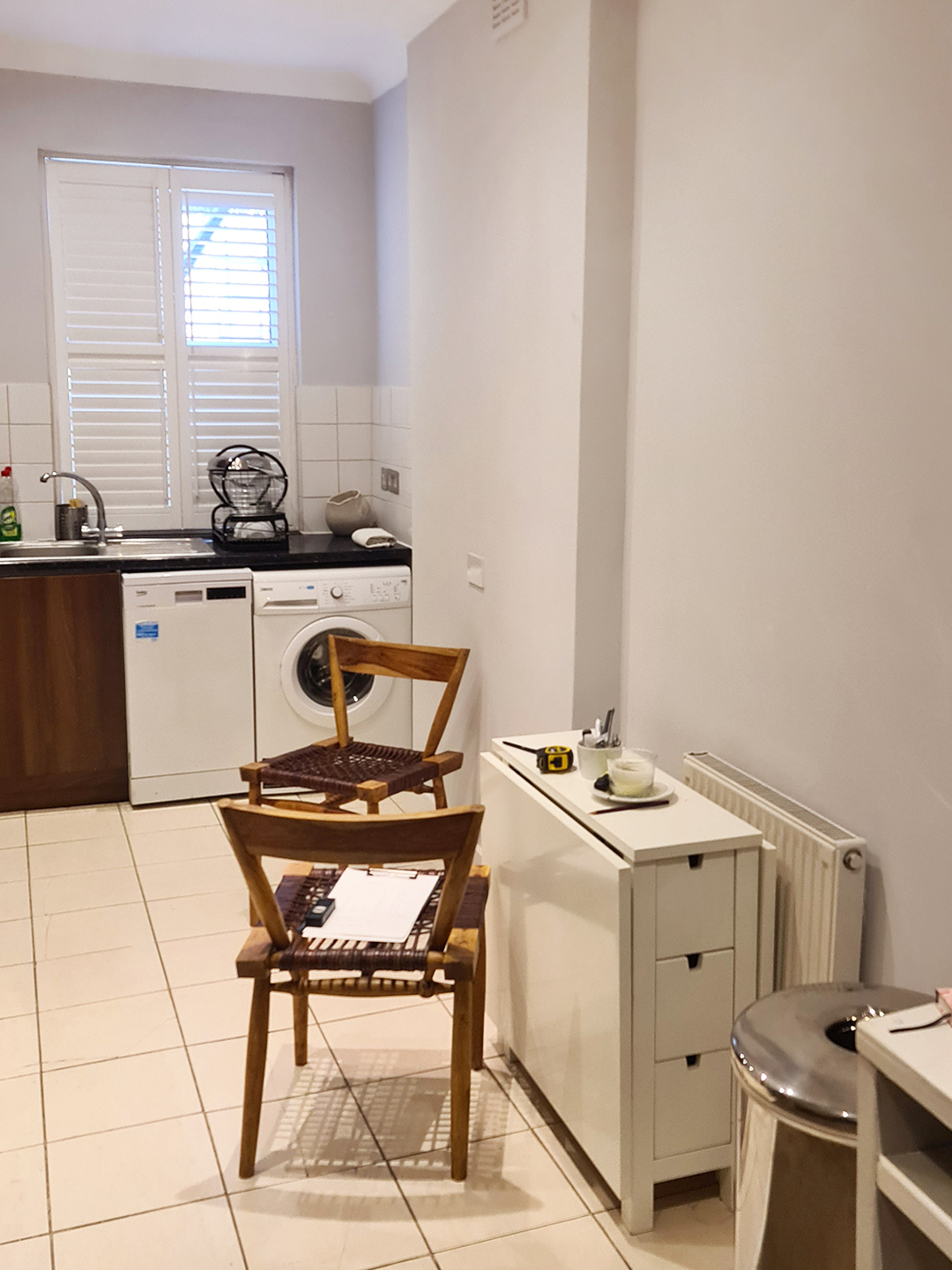
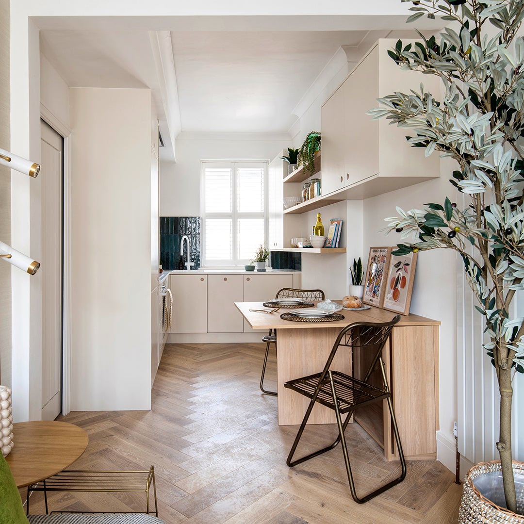
Starting from scratch, Dauley could maximize every square foot. The standard door that separated the kitchen from the hallway got the boot for a barely there pocket style. The niche next to the refrigerator? That’s now wine and tea towel storage. Even the countertops work harder; Dauley had a drain board carved into the surface next to the sink, nixing the need for a dish-drying rack. But the real magic is in the pop-up dining area. Before, her client made do by pulling seats up to a folding IKEA table. Dauley gave the concept a major upgrade with a built-in gate-leg design that not only stows away flat (leaving a ledge for knickknacks), it stores a set of elevated folding chairs.
The post A Pop-Up Table Makes This Tiny Kitchen Eat-In Friendly appeared first on domino.